Sber App
How eight product teams' overlapping money tools became one story for leadership and one clear experience for customers.
One story, eight teams
The bank's money-management features had grown one team at a time. I found the story that let leaders decide what to do first, then designed the decks and screens that told it.
- Client
- Sber · mobile banking app
- Scope
- Personal finance management: spending, budgets, savings, goals, tips and score
- Role
- Senior Art Director / Visual Lead: story structure, information design, leadership decks
- Timeline
- Nov 2022 to Mar 2023
- Audience
- Product and design leadership; eight product teams
- Tools
- Figma, presentation tools, motion prototypes
Features that worked alone, and a picture nobody could see
Spending analysis, budgets, savings, goals, envelopes, tips and a financial-health score each worked on their own. Leadership could not see the whole picture, and customers could not find one place to look.
Goals and envelopes served the same scenarios with the same logic gaps. Balances came from different algorithms. Tips showed duplicate badges and cut text mid-word.
Spending first, saving second
Most customers had almost nothing saved. The story had to start with seeing where money goes.
The message became: help people see where their money goes, then bring them into saving.
The portfolio split in two. Daily PFM (spending and savings) carries the mass audience. Wealth management (protection and investments) follows for people who are ready.
- Home screen spending widget
- Calendar events in the header
- Money for mandatory payments in an envelope
- Points and rewards that build a habit
Every screen answers one question first
One header for all savings. Scores that explain themselves. Tips with numbers, and a label when a model wrote them.
Icons and achievement badges
A 3D isometric icon set for the product's stories and services, and a badge series that rewards saving habits.


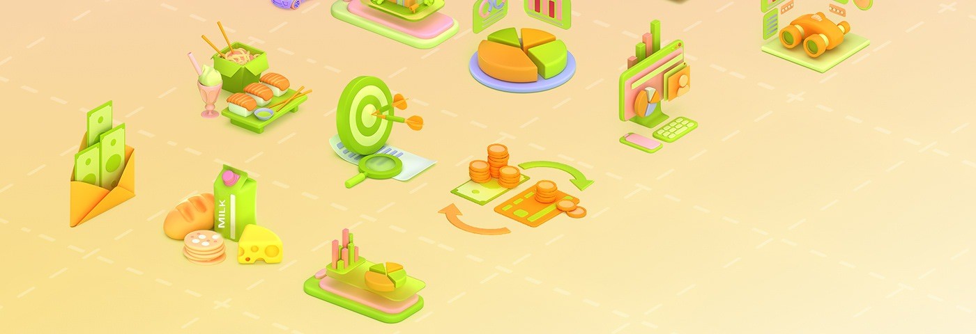

Achievement badges



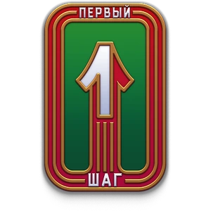


Enamel pinsThe set chosen for the app: one pin per everyday habit, from saving streaks to the first step in tracking.
Concepts
Earlier glass-style directions explored before the enamel pins were chosen.
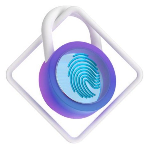

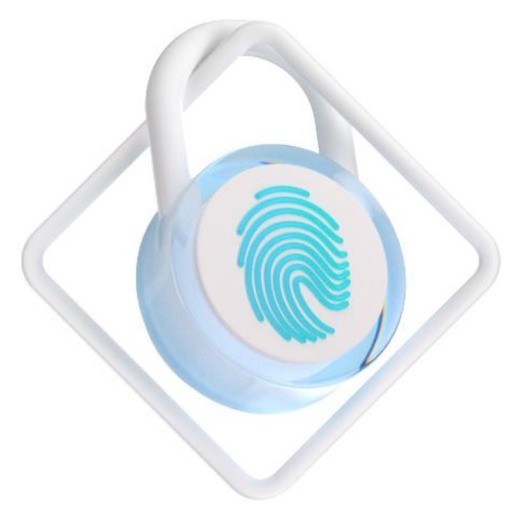
KeeperThree months in a row without taking money out of a goal with a balance of 1,000 RUB.


Success strategyOpened Spending analysis three months in a row.





Financial cushionA financial reserve of more than six months.

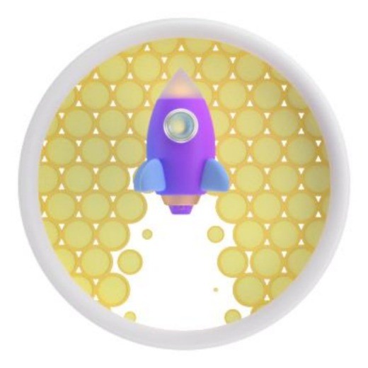

Forward to goalsTopped up goals for six months.

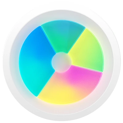
Final rendersKeeper and Success strategy in their finished glass material.
Goals, status and problems on one page each
A matrix of eight teams by quarter, status dots, and a UX-score deck that opens with counts before it tells the stories.
Every issue gets a claim and a fix
One slide states the problem and marks its severity. The next shows what changed, with screens where they help.
From idea to screens
How the score leads people into spending, savings and protection, step by step.
Two slides, redrawn
The score screens and the direct links into services, rebuilt in English with the same flow.
Screens that read in a second
Spending analysis, goals, calendar, stories and autosavings. Move down the page and the rows slide.
What shipped to the roadmap
By March 2023 the tribe tracked 38 design tasks, with 8 closed and 15 in progress, against a roadmap that ran through Q3 2023. The spending-analysis screens went through four design iterations, from Q2 2023 to 2024, each simpler to scan than the last.
My contribution
I led the story structure, headline and copy editing, the visual system of the decks, and the information design of savings, score, tips and spending views.
Product, research and engineering teams owned requirements, data and score logic, and delivery.
We shaped together priorities, the Daily PFM versus wealth-management split, and what moved into later releases.
Good communication design is a product decision. It tells a team what comes first, and it lets a customer see their own money clearly.
Tools
Fields
Credits
Story, design and motion: Serg Pedan.
Product, research and engineering: client teams.